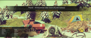
Ok so the very first impression is.. not much handholding. There’s no tutorial, and only basic introduction to the controls during the first few stages of playing. But this approach is used quite often by games these days and works well – although I still don’t know what some of the HUD elements represent!

The story starts off simple enough with you waking up next to a spaceship crash-site and only have a few options available. So the player is eased into each tool as he finds/builds/repairs it.
The environments are beautiful if you like this type of art style (I do as long as its consistent, which it is) but the planets/systems are hardly realistic unlike, for example, Elite Dangerous’s galaxy. But then you should know this if you’ve been following any of the hype. More importantly the game runs smoothly with only the briefest of pauses when saving – but that is more likely server related. There are occasional small graphical glitches especially when scenery changes quickly, and you can see features “pop in” especially when flying at speed over a landscape. Personally I think it’s quite acceptable and not too noticeable.
It is definitely a “survival/exploration” game, and you’ll be spending a fair amount of time gathering resources purely to stay alive and keep your equipment functioning. Whether that will grow old is something that remains to be seen. Exploration in this sense doesn’t only mean the in-game environments, but also the game mechanics. What does a “Bypass Chip” actually do? What are the benefits of feeding animals? How do you actually save the game? All things the player will eventually work out and it does lead to a sense of wonder of exploring a strange new world, at least for me. Others may find it frustrating.
So with the various hints in-game it didn’t take too long to fix my the spaceship and head off on my adventures. Right at the start you’re given a choice (I don’t know what the choice will mean yet) and there are hints of lore and a storyline when interacting with aliens so time will tell whether that’s just to add some colour to conversations, or whether more of a storyline will emerge as the game goes on. Initially at least, there’s a strong hint to follow a path towards the galactic center – at least with the initial choice I made.
All up I’m very happy with the game so far. From an interface perspective it all seems to work pretty well, the only thing which took me a while to work out was how to upload discoveries (via the Options button) unless I missed something earlier on.
Small niggles so far:
- you only get one attempt at naming something – no way to fix mistakes or (re)name something after upload.
- spaceship battles seem to be difficult to get the hang of (I’m struggling and various people in online media also seem to be).
- there’s no log of storyline conversations.
- no system-map once you’ve scanned a system (need to spend a minute spinning the ship around to each planet until you find the one you want to actually go to)
- no way of leaving markers or filling out a mini-map when exploring caves (it’s quite easy to get lost underground)
- no way of leaving markers for planetary locations you want to visit again
- the profanity filter is a tad harsh. “Spiked” is apparently naughty.. “spiky” isn’t.
But luckily the team seems to be very invested in this game and I’m sure it will be enhanced as time goes by – the huge 1-day patch is proof of that!
PS. The picture is a screenshot of a frame from my YouTube stream.. it is NOT representative of the actual game footage!
PPS. I’m streaming my playthrough and will be archiving it here.
